
Too Early for a Rebrand?
The goal has always been to evolve. I knew that at some point, Mad Rabbit Collective would need a facelift, but that was part of the plan from the beginning. I wanted to ensure that everything evolved and grew along with me. It was important to maintain a sense of familiarity while refining the details.
As I sat quietly, searching for design inspiration, my gaze drifted to our current logo. It struck me: maybe it was time for a refresh. Yet, that familiar adage echoed in my mind: "If it ain't broke, don't fix it." But once the notion lodged itself in my thoughts, retreat felt impossible.
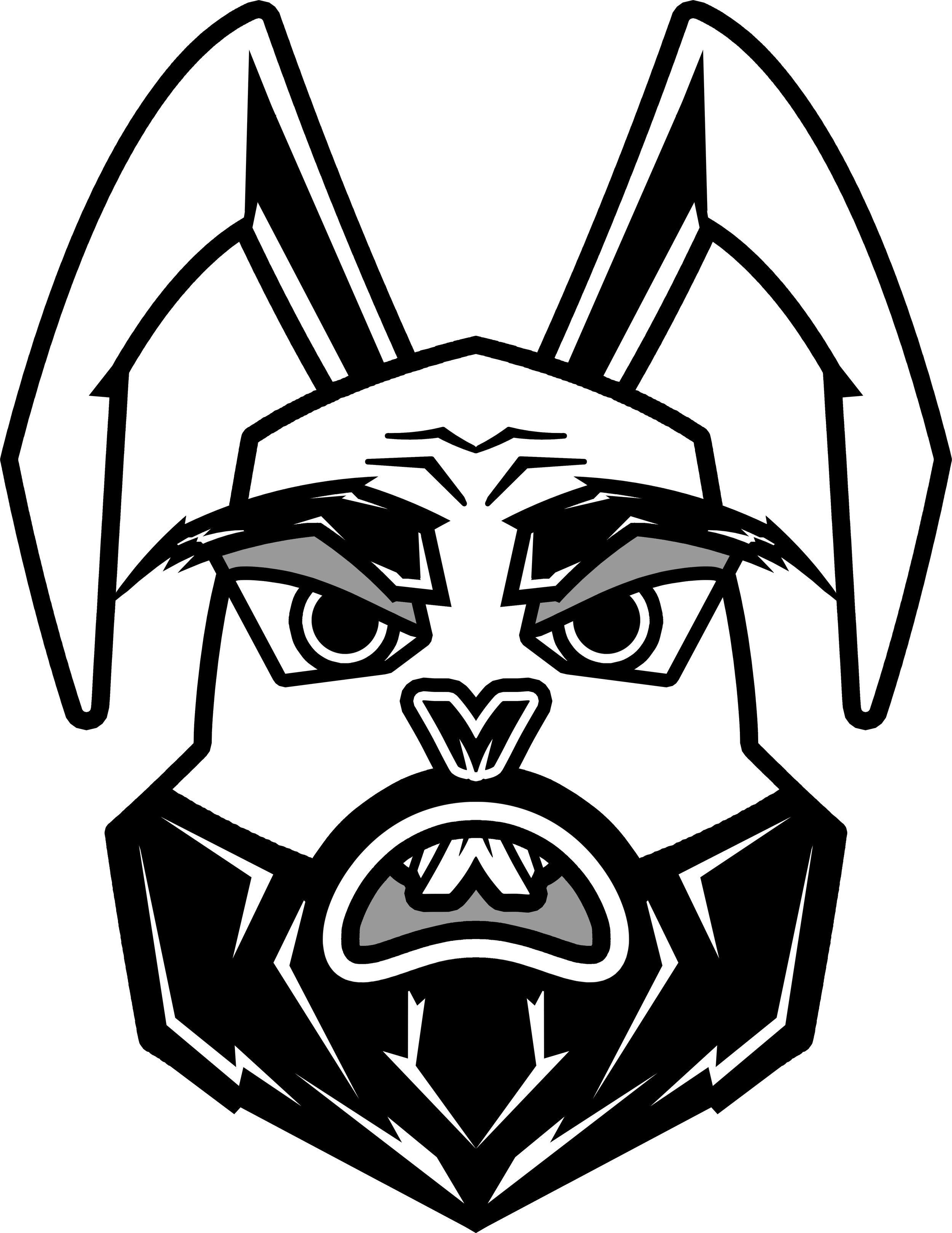
I began to ponder the potential changes I could implement. The ears, without a doubt! They had always been an element I was never particularly fond of when I first crafted this logo. Then I considered the eyes. If I revised them now, would I risk losing the unique character that gives our logo its charm? Should I take the plunge and create a more lifelike representation of a rabbit instead? The possibilities swirled around me, each one sparking new ideas and excitement.


Time for research
After deciding to embark on this creative journey, I eagerly began collecting a variety of images that highlighted features I believed needed refinement in the new version. My first area of focus was the eyes. As the saying goes, the eyes are the window to the soul, but I pondered how to make them compelling in a black-and-white logo. While sifting through countless images, one aspect stood out to me—the brow. I envisioned how this could enhance the overall character of the Mad Rabbit. What if I eliminated the furry eyebrow and emphasized the brow bone instead? This could lend a stronger, more defined expression.
In addition to the eyes, I also concentrated on redesigning the rabbit's beard and mouth, aiming to create a look that is not only distinct but also resonates with personality and charm. Every detail mattered, and I was excited about how these subtle changes could breathe new life into the design.


Time to Draft (BECAUSE EVERYTHING IS A DRAFT UNTIL IT’S NOT)
After gathering a few images for inspiration, I began sketching some ideas, primarily focusing on the eyes and ears. I took a couple of pictures of my sketches (though I’m not going to upload them) and imported them into Adobe Illustrator to start working. I spent a considerable amount of time trying to achieve a good expression with the eyes, as they would be the focal point of the design. Once I was satisfied with the eyes, I moved on to the ears.
Initially, I wanted to depict the ears in an upright position and sketched a few different versions, but none resonated with me. Then I remembered why I initially opted for floppy ears; they resemble the letter "M" (more on that later). So, I returned to the floppy ear concept and felt I was finally on the right track.
Next, I had to decide on the head shape. I found myself debating whether to make it more rabbit-like or incorporate human characteristics. I decided to take a picture of myself as a reference for the head shape. After making a few tweaks, particularly adding pointy edges, I settled on a shape I liked. However, I encountered another challenge: how big should the head be? Should it be long or short, skinny or fat? How much space should be above the eyes? I experimented with different proportions.
As I looked at my progress, I realized I wasn’t satisfied with what I had. I had floppy ears, a set of eyes, and a head shape, but it didn’t feel right. I refused to give up and went back to the drawing board. The eyes were okay, so I made some minor adjustments, but I still wasn’t pleased with the ears. I created another set and finally felt that I could work with them.
I decided to keep the mouth from the original logo, believing it would help connect the previous design to this new direction. I had experimented with a couple of redesigned versions, but they didn’t feel right. The original logo's teeth looked a bit goofy, but I thought it was essential to retain that characteristic. Upon closer inspection, you can see that the teeth are designed to resemble the letter "M"—only this time, it is upside down.
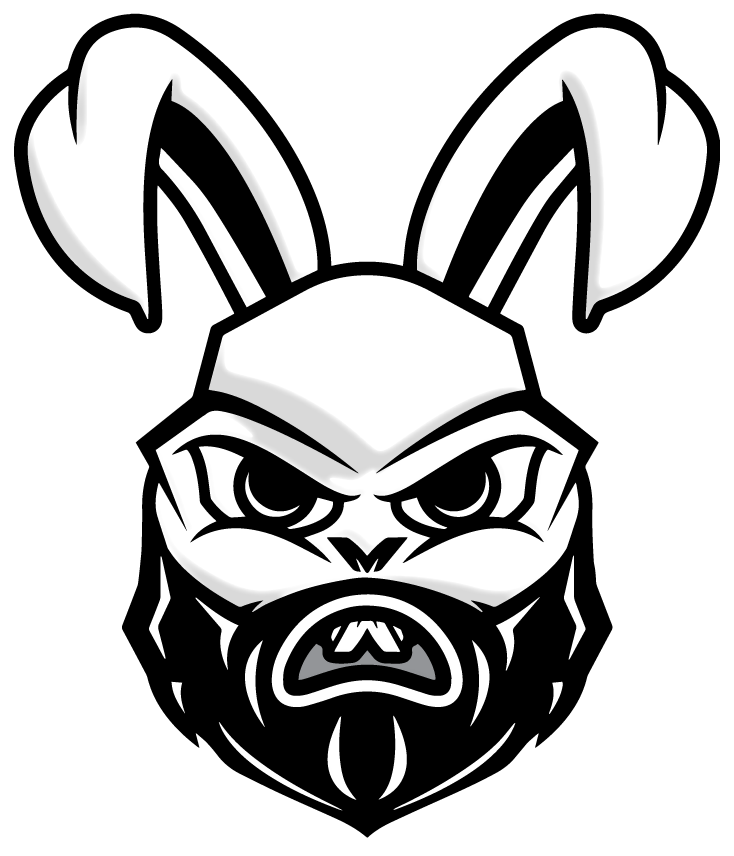
As I started arranging the various facial elements of the design, I felt that it wasn’t coming together as well as I had expected. Then I realized—it's the beard! I had initially planned to modify the existing beard to fit the new design, but it just wasn’t going to work. So, I created a new one, then another, and then another—about 15 iterations—until I found one I could work with.
After combining all the elements, I felt the design still lacked character. The eyes appeared aggressive, the floppy ears looked inviting, and the mouth conveyed an annoyed expression. While staring at my work, I realized I needed to adjust the head shape and beard length to enhance the overall design. Initially, I aimed for a smaller, rounder head shape, but the top of the head was too close to the eyes, which bothered me. I added more space above the eyes and slightly elongated the beard, and then it clicked. However, there was still one issue: I didn’t like the nose.
I had created a soft, rabbit-like nose, but it didn’t quite fit. So, I borrowed from the previous logo again, made a few tweaks, and now I feel good about this design.
Final Touches
After finally being satisfied with what I had in front of me, it was time to add the final enhancements. I wanted to maintain the white and gray streaks in the beard, so I drew new ones that would better fit this version of the Mad Rabbit. To give this new face more dimension, I decided to add some shadows.
I went back to the images I had saved and noticed that the ones with shadows (or lowlights) often featured them in a symmetrical manner. While I’m a huge fan of symmetrical design, I didn’t think that symmetry would be the key, but I had an idea.
I grouped all my layers and used the Inflate feature in Illustrator. After experimenting with the depth and lighting, I had a good reference for my shadows. I then locked the layer and created new paths for the shadows. Once I finished that, I removed the Inflate effect and adjusted my paths to ensure there weren’t any awkward gaps or spaces.
Wordmark
I’m on the brink of something exciting, feeling a rush of anticipation as I prepare to share this evolution. Now comes the task of updating the wordmark, a challenge that always tests my patience. How many times can I sift through countless typefaces, hoping to find the perfect one? What is the essence I’m trying to capture? I crave a design that is both bold and sleek, embodying a significant transformation.
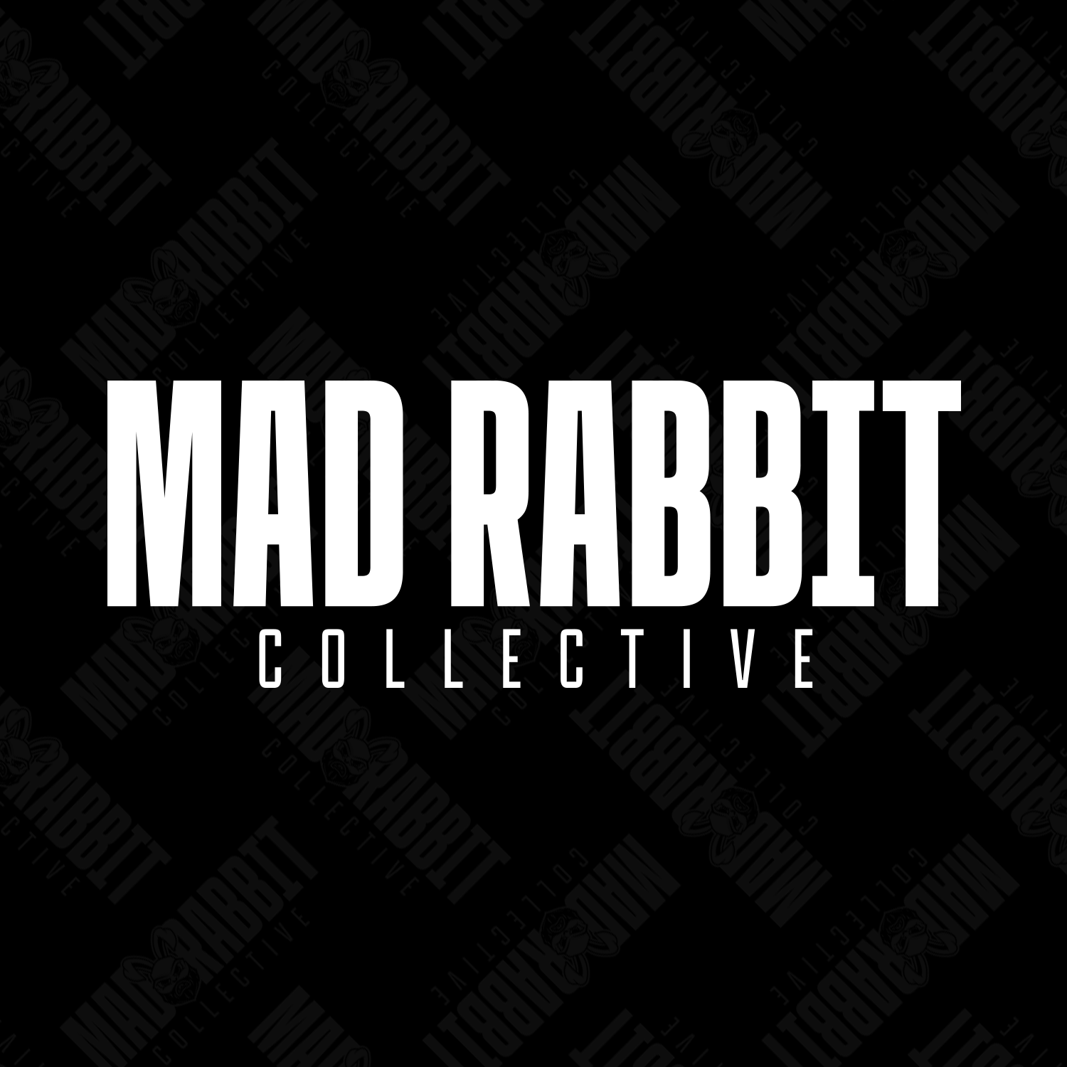
After attempting various filters with no success, I find myself diving into the vast world of Adobe Fonts, downloading every enticing font family I encounter. There, I stumble upon a striking monospaced font that resonates with me; its design has a distinct Marvel-esque vibe that captivates my imagination. I decided to pair it with another sans serif font that I've always admired, enhancing its elegance by increasing the tracking to create a more spacious and refined appearance.
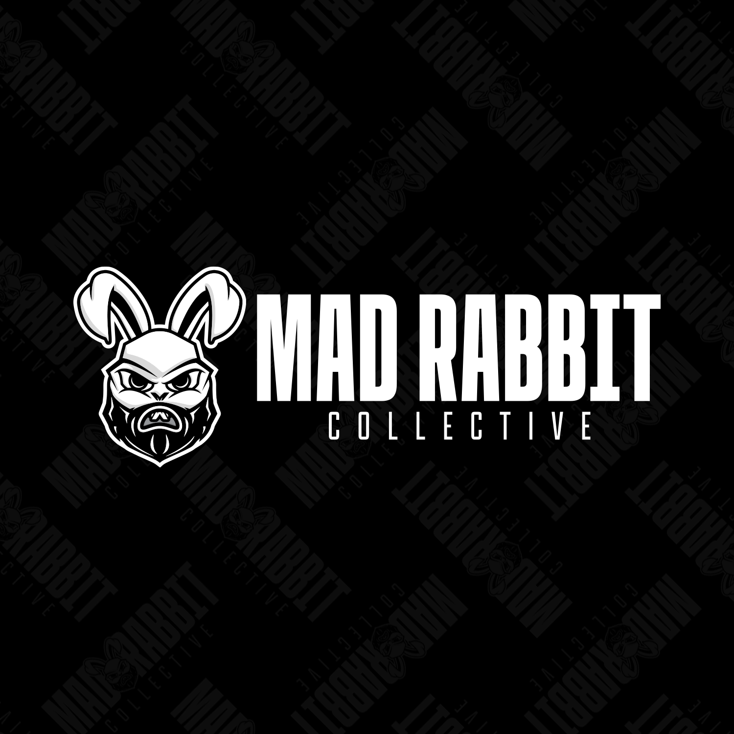
In a burst of inspiration, I have the whimsical idea to insert the rabbit icon between the words “mad” and “Rabbit.” The result is delightful, and I’m thrilled with how it all comes together—it feels fresh and invigorating.
Final Designs


I hope you like it!